Behaviors Overview
Behaviors are the interaction system that makes your VR/AR presentations come alive. Without behaviors, markers are static visual elements. With behaviors, they respond to user actions – navigating between slides, showing and hiding content, playing media, tracking quiz answers, and much more.
Every behavior follows the same model:
When [trigger] happens on this marker → do [action] (with optional [conditions])
For example: When the user clicks this button → navigate to the next slide. Or: When the user hovers over this icon → show a hidden text label.
The Behavior Editor
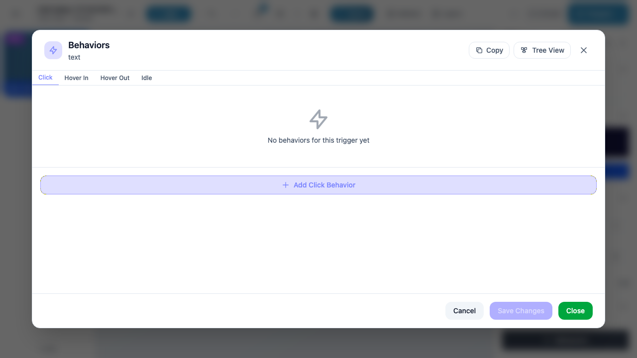
The Behavior Editor is a modal dialog where you create, edit, and manage all behaviors attached to a single marker. It organizes behaviors by trigger type using a tabbed interface.
Opening the Behavior Editor
- Select a marker – click it on the canvas or select it in the Layers panel.
- Open the Properties panel – press P or click the marker name in the Layers panel.
- Click the “Behaviors” button at the bottom of the Properties panel.
The Behavior Editor modal opens, showing all behaviors for the selected marker.
Tip
The modal header shows the marker type (e.g., “text”, “mimg”, “3dob”) below the “Behaviors” title. This helps you confirm you are editing behaviors for the correct marker.
Modal Layout
The Behavior Editor is divided into four sections:
Header
| Element | Description |
|---|---|
| Title | “Behaviors” with the marker type displayed underneath |
| Copy button | Copies all behaviors for this marker to your clipboard. You can then paste them onto a different marker. |
| Tree View button | Switches to an alternative tree visualization that shows all behaviors across all triggers in a hierarchical view. |
| X button | Closes the modal. If you have unsaved changes, a confirmation prompt appears. |
Trigger Tabs
Below the header, a row of tabs lets you switch between trigger types. The tabs shown depend on the marker type – a basic text marker shows Click, Hover In, Hover Out, and Idle, while a 3D Object marker shows additional tabs like Grab, Collide, and Animation Start.
Each tab displays a badge count when it has one or more behaviors. For example, if you have created two Click behaviors and one Hover In behavior, the Click tab shows “2” and the Hover In tab shows “1”. Tabs with no behaviors show no badge.
For the full list of which triggers are available on each marker type, see Triggers.
Behavior List
The main area of the modal shows all behaviors for the currently selected trigger tab. When no behaviors exist for a trigger, you see an empty state with a lightning bolt icon and the message “No behaviors for this trigger yet.”
When behaviors do exist, each one is displayed as a compact row:
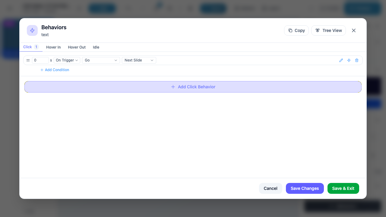
Each behavior row contains:
| Field | Description |
|---|---|
| Delay | The number of seconds to wait before executing the action (e.g., “0 s” for immediate). |
| Timing | When the delay starts counting. Options: On Trigger (from the moment the trigger fires), Prev Action Start (from when the previous behavior’s action started), Prev Action Finish (from when the previous behavior’s action completed). |
| Action | What happens when the behavior executes (e.g., “Go”, “Show”, “Hide”, “Play”). |
| Target | The target of the action (e.g., “Next Slide”, a specific marker name, a URL). |
On the right side of each row, three icon buttons appear:
| Icon | Action |
|---|---|
| Pencil (edit) | Expands the behavior row into an editable form where you can change the action, target, delay, and timing. |
| Pin | Pins the behavior so it stays expanded. Useful when you are working on multiple behaviors and want to keep one visible. |
| Trash (delete) | Removes the behavior. The deletion is not saved until you click Save Changes or Save & Exit. |
Below the last behavior row (or below the empty state), the “+ Add [Trigger] Behavior” button lets you create a new behavior for the current trigger. The button label matches the active tab – for example, “+ Add Click Behavior” on the Click tab, or “+ Add Hover In Behavior” on the Hover In tab.
Info
You can add multiple behaviors to the same trigger. For example, a single Click trigger can show one marker, hide another, and navigate to a new slide – all with different delays to create a sequenced animation.
Footer
The footer contains three buttons:
| Button | Appearance | Description |
|---|---|---|
| Cancel | White/outline | Discards all unsaved changes and closes the modal. Any behaviors you added, edited, or deleted since the last save are reverted. |
| Save Changes | Purple (disabled when no changes) | Saves all pending changes but keeps the modal open. Use this when you want to save your progress and continue editing. The button is grayed out when there are no unsaved changes. |
| Save & Exit | Green | Saves all pending changes and closes the modal. This is the most common way to finish editing behaviors. Only appears when there are unsaved changes (otherwise the button shows “Close”). |
Warning
If you close the modal (via the X button or the Close button) without saving, a confirmation dialog warns you about unsaved changes. Always use Save Changes or Save & Exit to preserve your work.
Behavior Model
Every behavior has the following properties:
| Property | Required | Description |
|---|---|---|
| Trigger | Yes | The event that activates this behavior (determined by the tab it belongs to). |
| Action | Yes | What happens when the behavior executes. See Actions for the full list. |
| Target | Depends on action | The object the action applies to – a marker, a slide, a URL, or a media element. Not all actions require a target. |
| Delay | Yes (default: 0) | How many seconds to wait before executing. Allows you to sequence multiple behaviors with staggered timing. |
| Delay From | Yes (default: On Trigger) | When the delay countdown starts: from the trigger event, from the start of the previous action, or from the end of the previous action. |
| Conditions | No | Optional rules that must be satisfied for the behavior to execute. See Conditions. |
Copying Behaviors Between Markers
The Copy button in the modal header copies all behaviors from the current marker to your clipboard. You can then select a different marker, open its Behavior Editor, and paste the behaviors. This is useful when multiple markers need identical or similar interaction logic.
Tip
After pasting, you can edit individual behaviors to adjust targets or delays without rebuilding the entire interaction from scratch.
Tree View
The Tree View button switches the Behavior Editor to a hierarchical visualization. Instead of showing behaviors grouped by trigger tab, Tree View displays all behaviors for the marker in a single tree structure:
Marker
├── Click
│   ├── Behavior 1: Go → Next Slide
│   └── Behavior 2: Show → Label
├── Hover In
│   └── Behavior 1: Show → Tooltip
└── Idle
    └── Behavior 1: Hide → Tooltip
Tree View is especially helpful when a marker has many behaviors across multiple triggers and you want to see the full picture at a glance. Click Tree View again (or the list icon) to return to the tabbed view.
Workflow Example
Here is a typical workflow for adding interactivity to a marker:
- Select the marker on the canvas or in the Layers panel.
- Open Properties (press P) and click Behaviors at the bottom.
- The Behavior Editor opens on the Click tab by default.
- Click + Add Click Behavior.
- Choose an action (e.g., Go) and a target (e.g., Next Slide).
- Leave the delay at 0 s for an immediate response.
- Click Save & Exit to save and close.
The marker now navigates to the next slide when clicked during a presentation.
Next Steps
- Triggers – Learn which triggers are available for each marker type
- Actions – Explore all available actions (navigation, show/hide, media, polls, and more)
- Conditions – Add conditional logic to make behaviors context-aware